
In the last years of the 17th century, Dutch artist A. Boogert decided to collect, categorize, and record every color. He cataloged over 800 hand-painted swatches and described the recipe for mixing each tint. This visually stunning book isn't the first attempt to distill the world's colors.
Artists, designers, and scientists have spent decades plotting colors on graphs, studying color across cultures, and assigning codes to each hue. The desire to map all shades of color is rich with history, knowledge, and emotion.


Klaer Lightende Spiegel der Verfkonst by A. Boogert
Newton's Discovery of Color and Light
Using a prism to separate light into seven colors was an old magic trick in the 1700s. But Isaac Newton knew there was something more behind the stunt. In his book Opticks, Newton challenged the common idea that color was modified white light. He conducted an experiment where he directed the rays refracted by the first prism through a second prism.
Newton's Prism Experiment
Newton realized that all the colors in the rainbow are their own form of light. Colors are the original components of white light. When we see white light, what we really see, is all the colors adding together.
Goethe's Color Theory
Newton's theory was hotly debated well into the 19th century. In particular, it didn't make sense for Goethe.
Johann Wolfgang von Goethe was one of the last Renaissance men of the late 18th and early 19th centuries. Besides a poet, he was also a novelist, playwright, botanist, geologist, scientist, politician, philosopher, historian, and theorist. Goethe's artistic experience signaled that Newton's color theory was wrong.
Goethe, and any preschooler knows that when you mix all the colors on your paint palette, you don't get white. A murky brown-grey color forms. Goethe didn't believe color was a property of light. He thought it was a "degree of darkness."
"Light and darkness, brightness and obscurity, or if a more general expression is preferred, light and its absence, are necessary to the production of color… Color itself is a degree of darkness."
Goethe failed to realize there are two ways to mix colors: adding and subtracting. With additive mixing, different light wavelengths combine to create white light. This is what Newton demonstrated with his prisms.
When paints mix, the opposite happens. Because each pigment reflects a portion of available light, when mixed together, more wavelengths are subtracted. The more paint mixed together, the less you see of the visible light spectrum, and the darker the mixture becomes.

The mixing differences between additive and subtractive color systems.
The point goes to Newton to describe the physics and science of color, but Goethe wins the case for color psychology. He illustrated the sensual qualities of color in his book Theory of Colors. Yellow has a "serene, gay, softly exciting character," while blue is a "contradiction between excitement and repose."

Goethe's color wheel
Goethe approached color theory with a history of art and psychology instead of a background in physics. He felt that his view would allow everyone to become an artist and explore color up close than from the distance of science, an objective view without meaning which reduced the beauty, secrets, and harmony of colors.
“Goethe’s colour theory has in many ways borne fruit in art, physiology and aesthetics. But victory, and hence influence on the research of the following century, has been Newton’s.” – Werner Heisenberg
Kandinsky and Color
Goethe's work was well-received among artists and influenced the famous abstract painter Wassily Kandinsky. One of Kandinsky's most recognizable works is a direct study of color combinations.

Color Study- Squares with Concentric Circles by Wassily Kandinsky, 1913
When you look at Squares with Concentric Circles, the colors seem to pulsate, giving a painting life. Kandinsky used the emotions of color to influence each person differently. He even created a directory of colors and meanings:
Yellow – “warm,” “cheeky and exciting,” “disturbing for people,” attack, madness
Green – peace, stillness, passive, mix of yellow and blue. The absolute absence of movement, is good for tired people, but after the rest the feeling of calmness can become boring.
Blue – peaceful, supernatural, deep, “typical heavenly color”, The lighter it is, the more calming it is. When in the end it becomes white, it reaches absolute calmness.
Red – restless, glowing, alive, “manly maturity”
Light Red – is a warm color, expresses joy, energy and triumph.
Middle Red – evokes feeling of stability and passion
Dark Red – as any other cool color is a deep one, it can be made even deeper with light blue.
Brown – dull, hard, inhibited, mix of red and black
Orange – radiant, serious, healthy, mix of red and yellow
Violet – “morbid, extinguished […] sad”, mix of red and blue
White – “It is not a dead silence, but one pregnant with “Harmony of silence”, possibilities.” Is the harmony of silence.
Black – extinguished, immovable, “Not without possibilities […] like an eternal silence, without future and hope.” While the white expresses joy and spotless cleanliness, the black is the color of great grief.
Grey – is the balance between the white and black. It is soundless and motionless, but it differs from green, because the green is a mixture of two active colors, while the grey expresses a hopeless stillness.

Composition VIII by Wassily Kandinsky, 1923
Kandinsky had a neurological disorder called synesthesia. People with synesthesia can smell something after hearing a noise or see shapes when eating different foods. Kandinsky saw colors when he heard music and often listened to music while painting.
"The sound of colors is so definite that it would be hard to find anyone who would express bright yellow with base notes, or dark lake with the treble." – Wassily Kandinsky
He experienced a different dimension of color and this comes across in his paintings.

Circles in a Circle by Wassily Kandinsky, 1923
Werner's Nomenclature of Colors
Abraham Gottlob Werner was a geologist who first studied law, then rocks, then color. His first discovery in geology came when he developed Neptunism, which theorized that rocks originate from salts and minerals of oceans. Neptuism was later disproven by Plutonism, which holds that rocks emerge from the cooling and hardening of magma.
Through his work, Werner amassed a collection of colorful rocks and minerals. This was the starting point for his new project–– developing an encyclopedia for colors. His classification system for naming minerals gave Werner an entirely new vocabulary to describe the hues of the natural world. His handbook described colors with such precision, such as "Skimmed Milk White" and "Flax-Flower Blue."
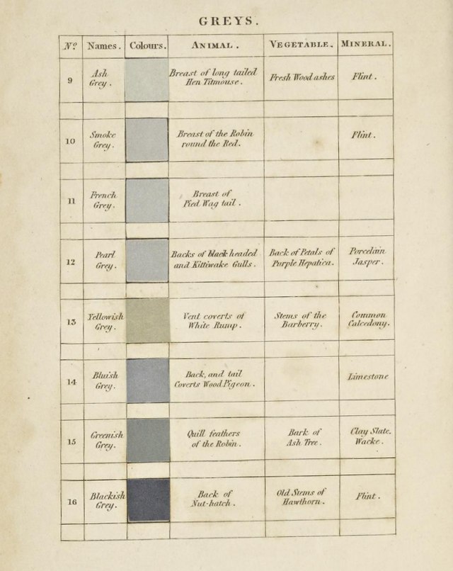

Werner's Nomenclature of Colours by Patrick Syme
Besides the distinct color names, Werner's Nomenclature of Colors was even more extraordinary with Patrick Syme's drawings of plants and animals. Each color was tied to a specific tint from nature.
This was useful to scientists because it eliminated the subjectiveness of color. One of Werner's students was the legendary Charles Darwin. On his trip on the HMS Beagle, Darwin used Werner's colors to document the color change of an octopus:
"the Chamælion like power of changing the colour of its body.— The general colour of animal was French grey with numerous spots of bright yellow. — the former of these colours varied in intensity.— the other entirely disap- peared & then again returned.— Over the whole body there were continually passing clouds, varying in colour from a ‘hyacinth red’ to a ‘Chesnut brown’."
The fine details of each color are from Werner's book. The standardization of colors allowed scientists and explorers to describe their findings without losing the details.

Octopus from Art Forms in Nature by Ernst Haeckel
Contradictions of Color
"Each color lives by its mysterious life." – Wassily Kandinsky
We see Newton and Werner on the side of science, developing theories and standardized names for colors. Meanwhile, Goethe and Kandinsky want color to penetrate deeper than the eye and into the heart of the viewer. Scientists measure and compare different wavelengths while the painter creates mood and life through color. One might see this dynamic between science and art and see them clash.
But that is what is exciting.
There is a constant order-chaos dynamic of categorizing and ordering the world of color and letting free their unruly, subjective, and emotional selves. In a way, it's a reminder of ourselves — our intrinsic desire for order and knowledge with bouts of artistic and creative expression. Perhaps we should let color roam and bask in this complexity. We can study and prod colors with the most powerful microscopes, but color will always retain a hint of untouchable mystery and magic.
"Colors are not possessions; they are the intimate revelations of an energy field… They are light waves with mathematically precise lengths, and they are deep, resonant mysteries with boundless subjectivity." -Ellen Meloy